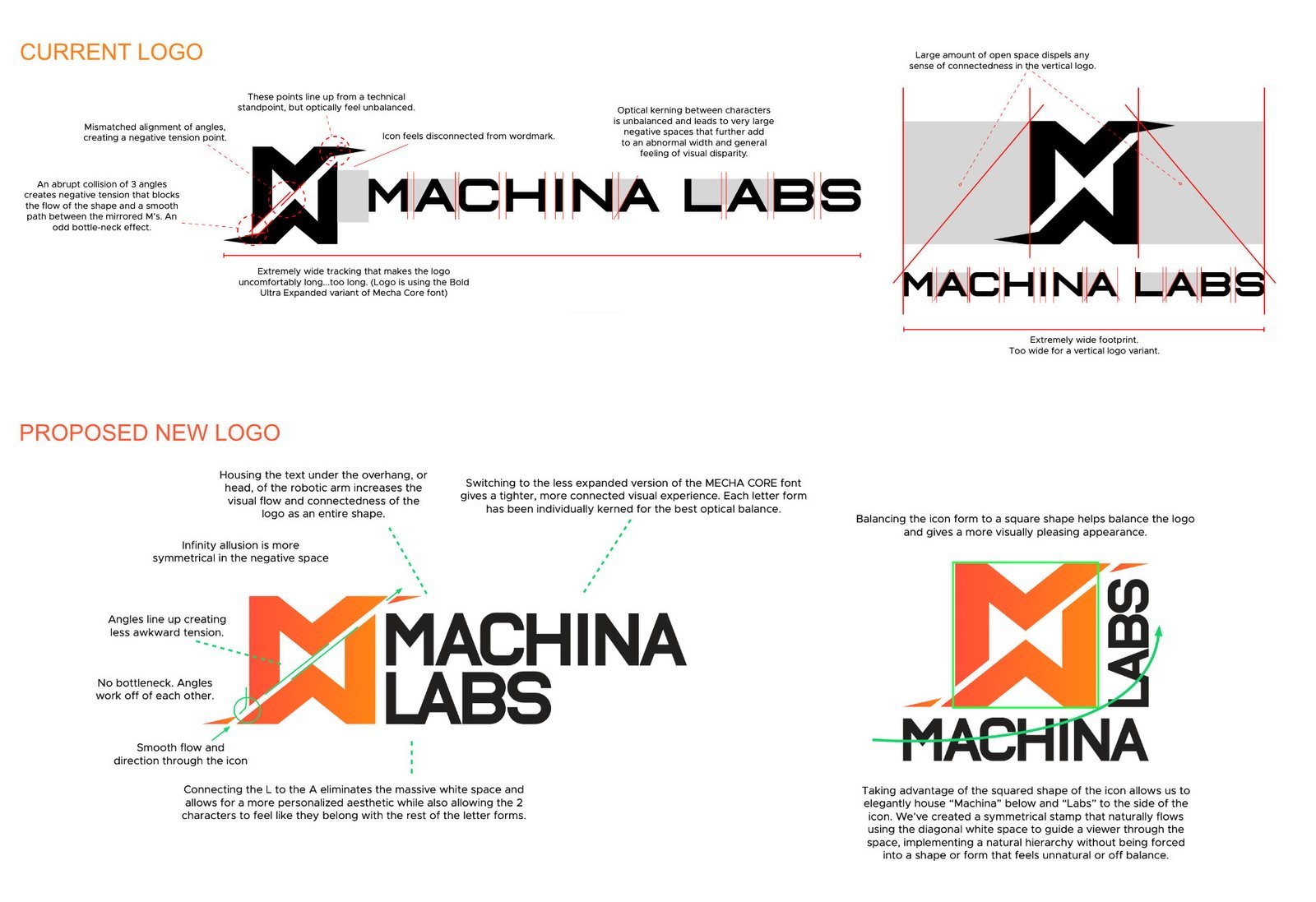
Refining a technical brand for balance, clarity, and scalability
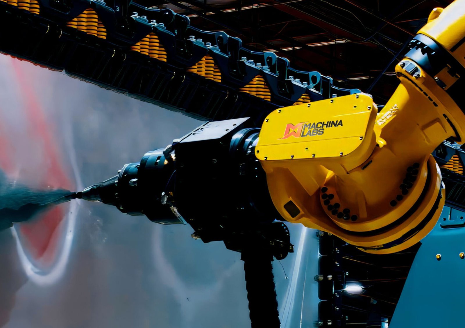
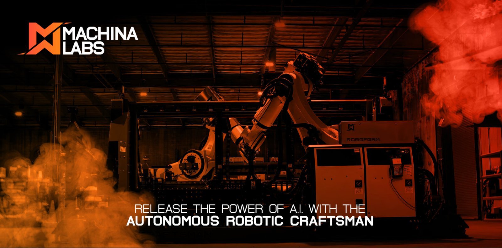
Machina Labs builds autonomous robotic systems for advanced sheet metal forming. The engagement began as a request for a vertical logo to complement an existing horizontal mark that was difficult to deploy across applications.
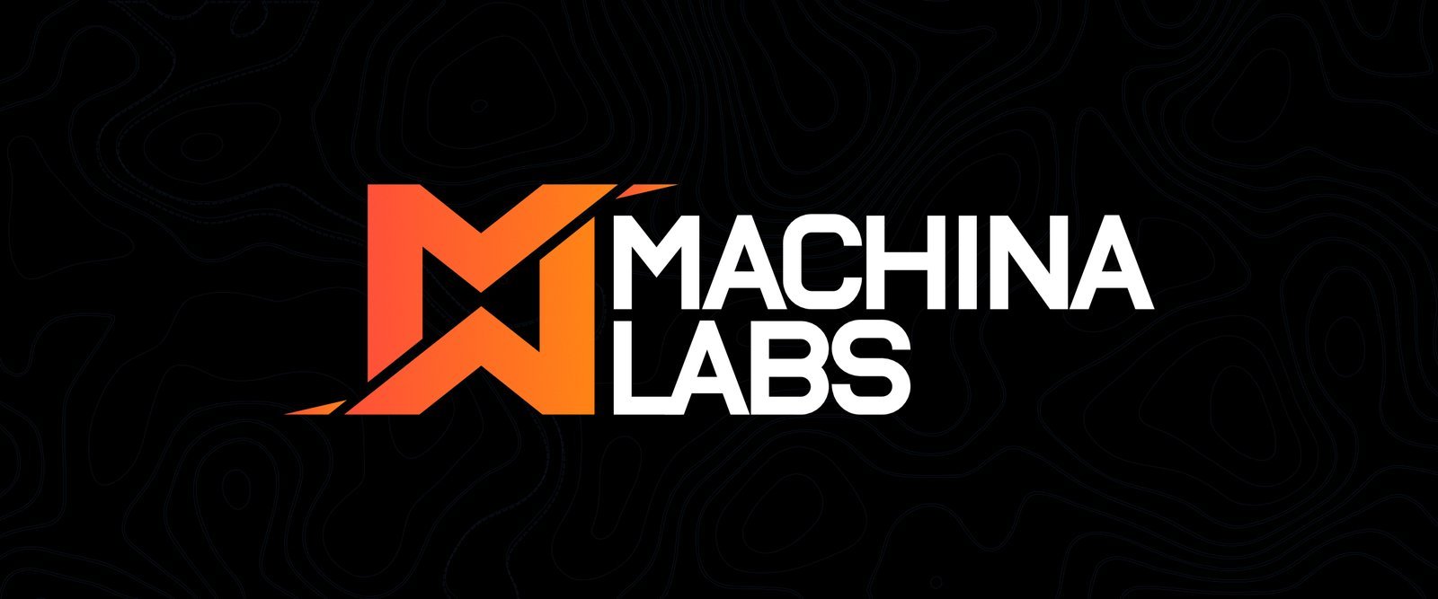
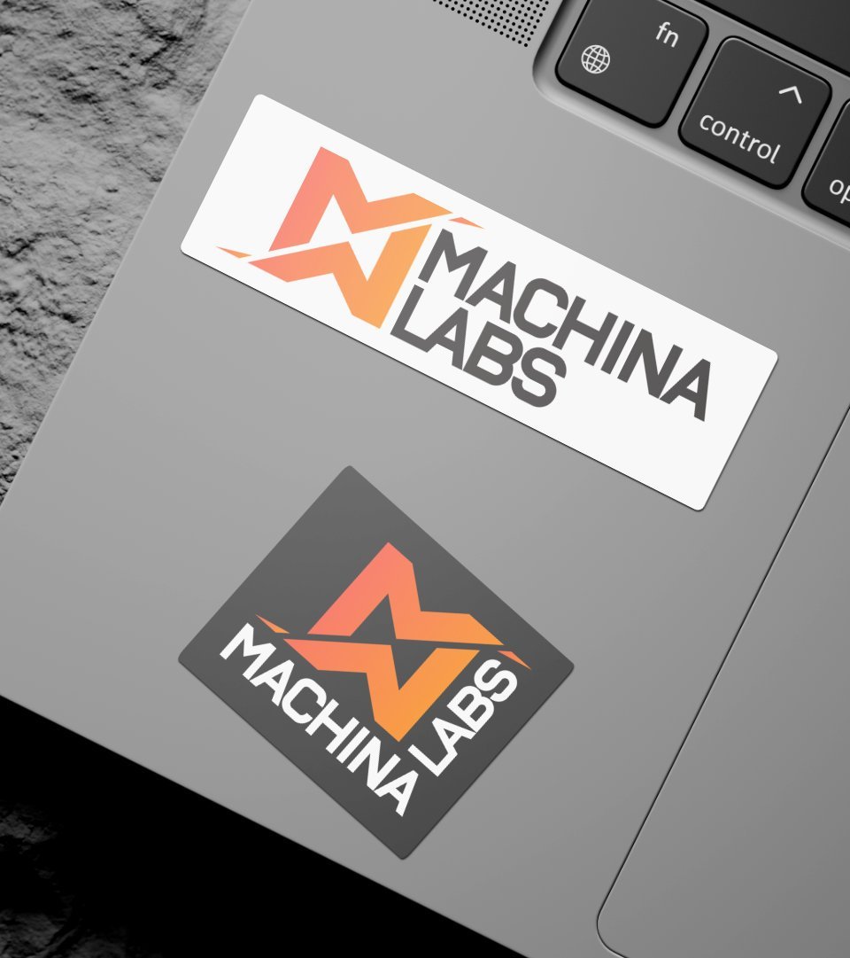
The work expanded into an identity refinement. The horizontal logo was refined for improved balance, hierarchy, and visual flow, while a new vertical version increased flexibility across mediums. Typography was refined by pairing Metropolis with the existing MECHA CORE type, improving legibility and brand strength while maintaining a modern, forward-looking tone without leaning into sci-fi clichés.
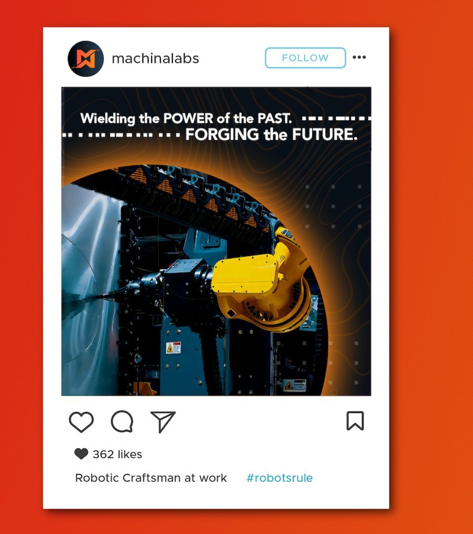
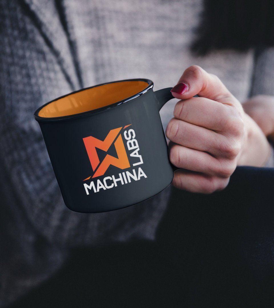
Color exploration drew inspiration from traditional metal forging. Fiery orange and red tones referenced the craft and heat behind the traditional manufacturing process, reinforcing Machina as a modern robotic craftsman rooted in industrial tradition.