Branding and web design for a service-based moving support company
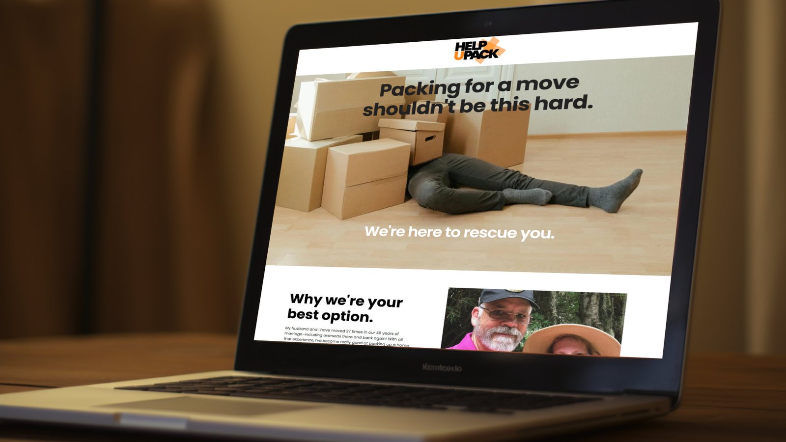
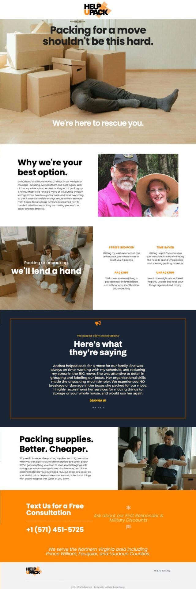
HelpUPack approached us for a focused engagement: a logo and a one-page landing site to clearly communicate their role in the moving process. As a packing and unpacking service (not a moving or transportation company) the brand needed to signal relevance within the moving industry while clearly differentiating its offering.
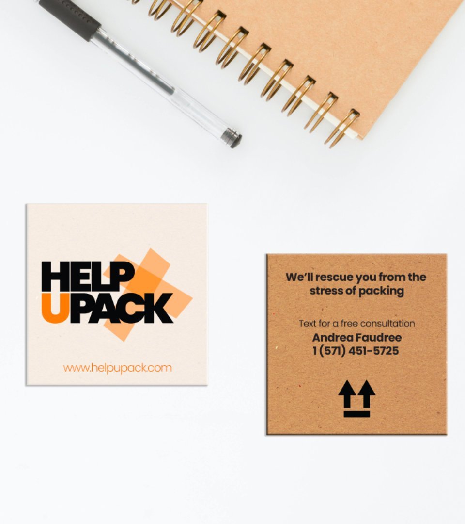
We selected Poppins in its boldest weight for immediate visual impact and paired it with a bright orange, black, and white palette to ensure strong category recognition. For the logo mark, we deliberately avoided common moving clichés like houses or boxes, opting instead for crossed strips of packing tape, an honest, functional symbol of the service itself. The form subtly alludes to the owners’ Christian faith through the shape of a cross, integrated thoughtfully rather than overtly.
The website centers on empathy and approachability, featuring a hero image of a person overwhelmed by boxes to reflect the stress most people experience during a move. Supporting imagery transitions into lighter, more optimistic scenes, reinforcing HelpUPack’s promise to make packing smoother, calmer, and even enjoyable.