Brand identity for a fashion startup positioned above the boutique norm
Farije Ademi Apparel approached us as a startup seeking a brand identity that avoided the common traps of small, “cutesy” boutique fashion brands. Their ambition was to feel elevated from day one. Sleek, confident, and rooted in a higher-end, urban European aesthetic reminiscent of modern nightlife fashion.
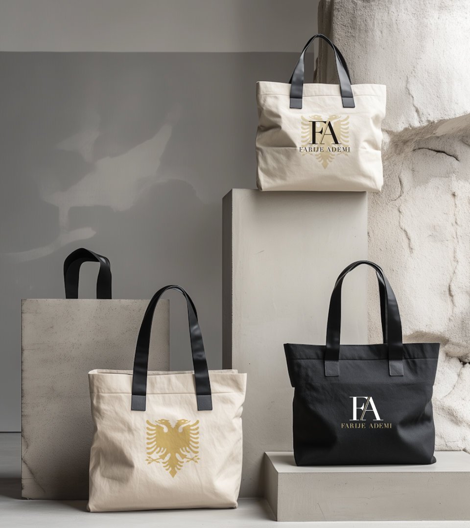
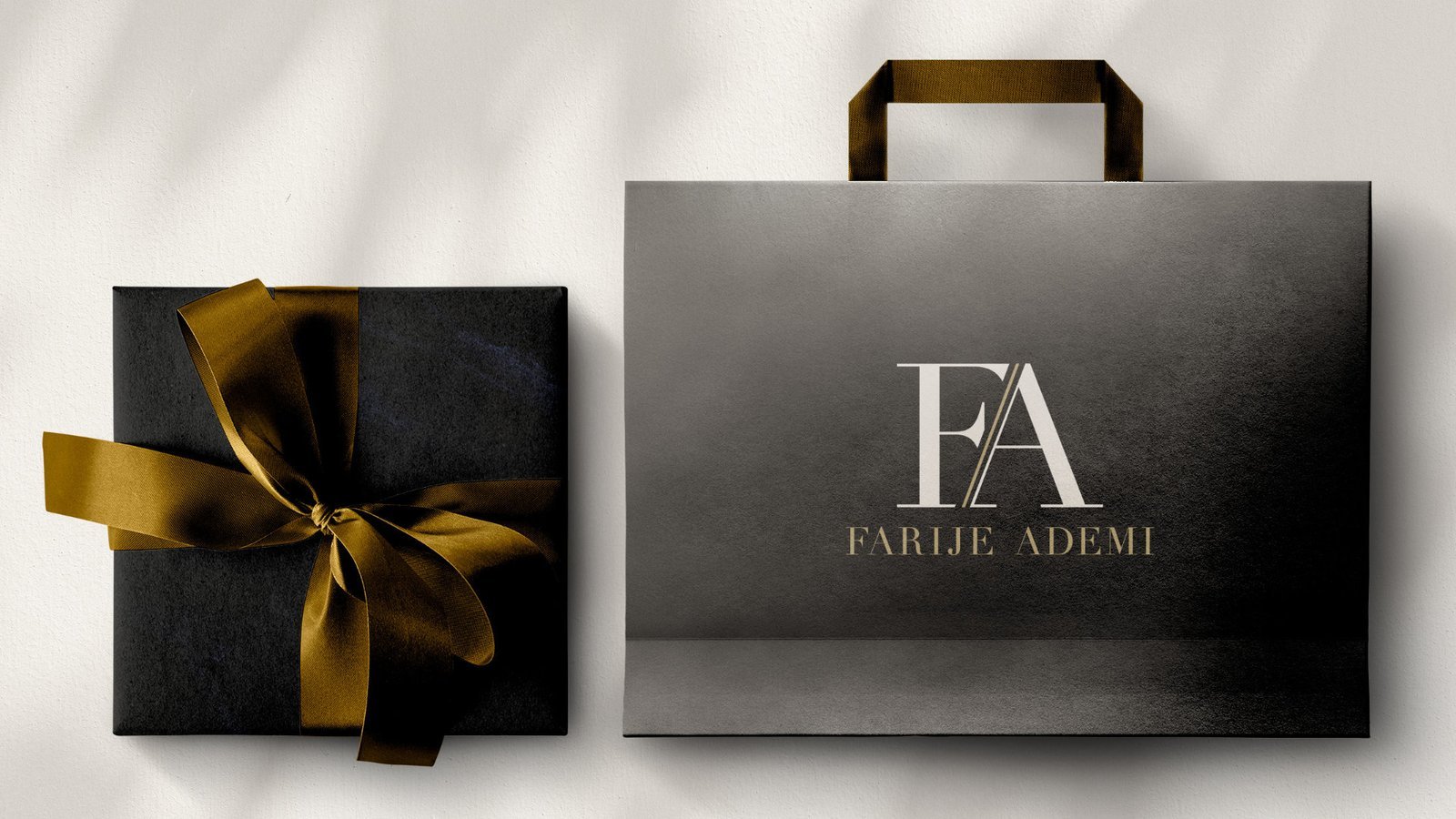
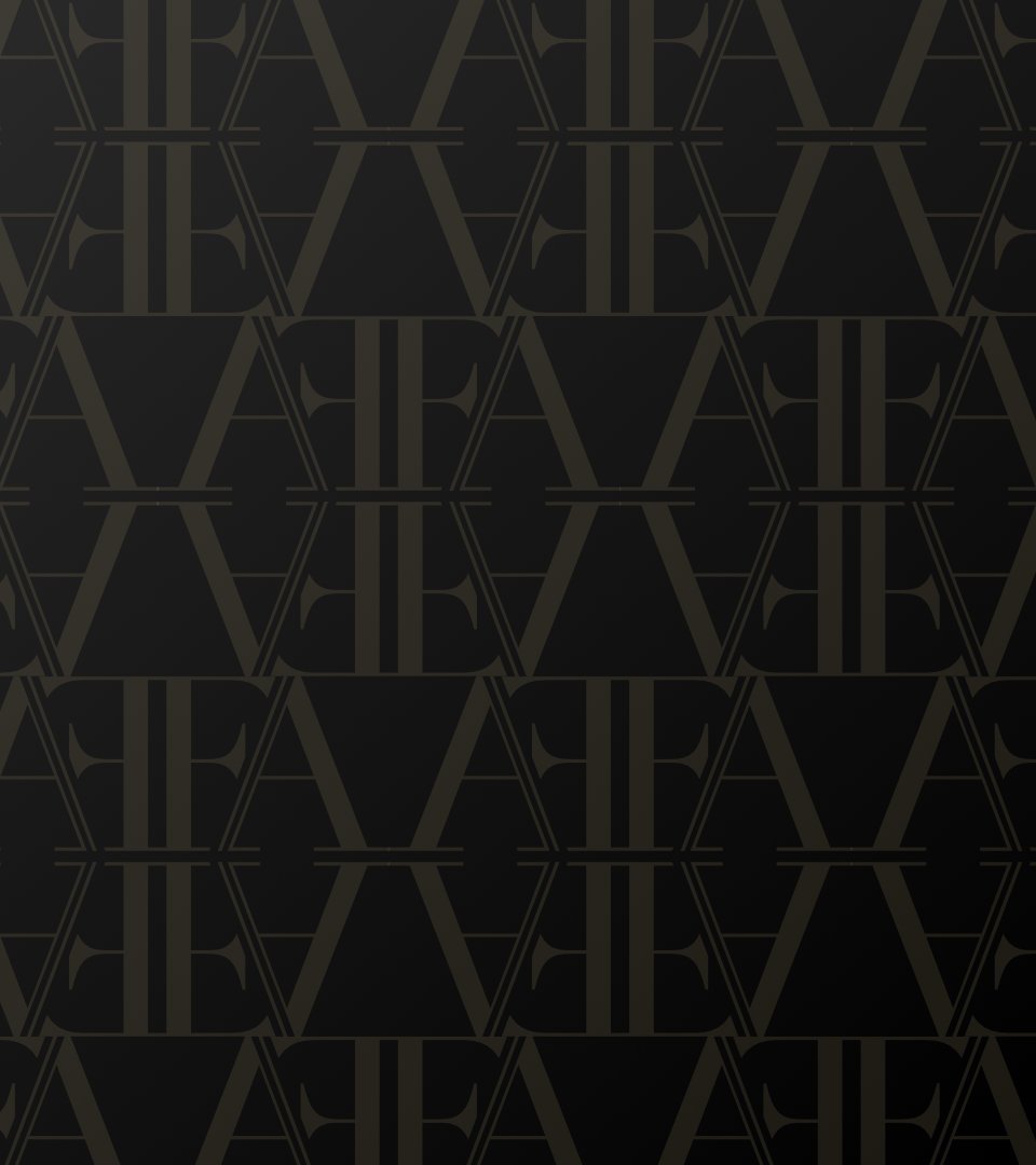
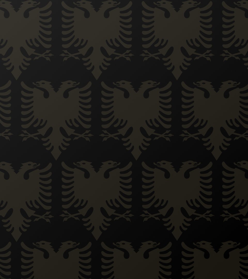
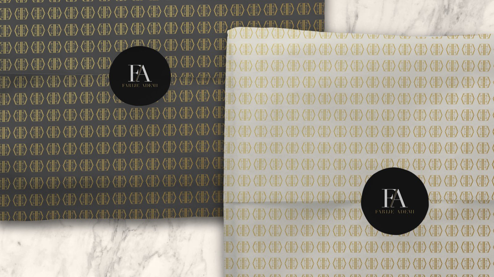
We developed a refined brand system anchored by a strong wordmark, supported by a flexible brand pattern designed for use across packaging, shopping bags, tissue paper, and accessories. The color palette was intentionally restrained (black, white, and a gold-toned champagne) to reinforce quality and sophistication. Didot was selected for its dramatic contrast between thick and thin strokes, delivering a bold yet luxurious typographic voice.
The resulting identity positioned F/A as confident, premium, and intentional allowing the brand to stand comfortably alongside more established fashion labels rather than being perceived as an emerging boutique experiment.