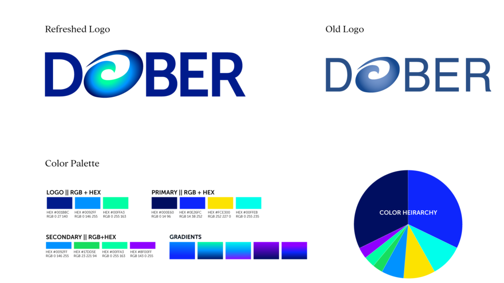
Dober had little in the way of a cohesive brand system. A loosely defined color palette and a generic logo did not reflect the depth or precision of their work.
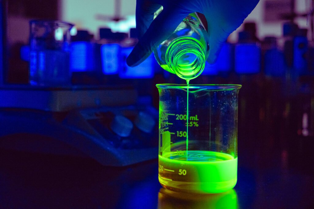
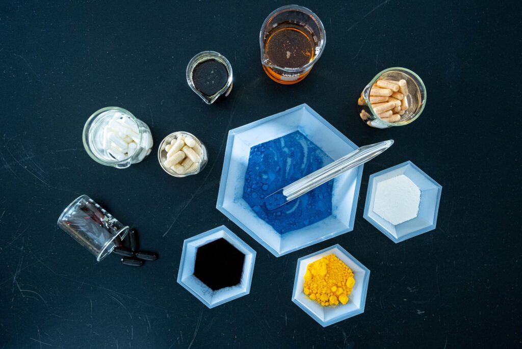
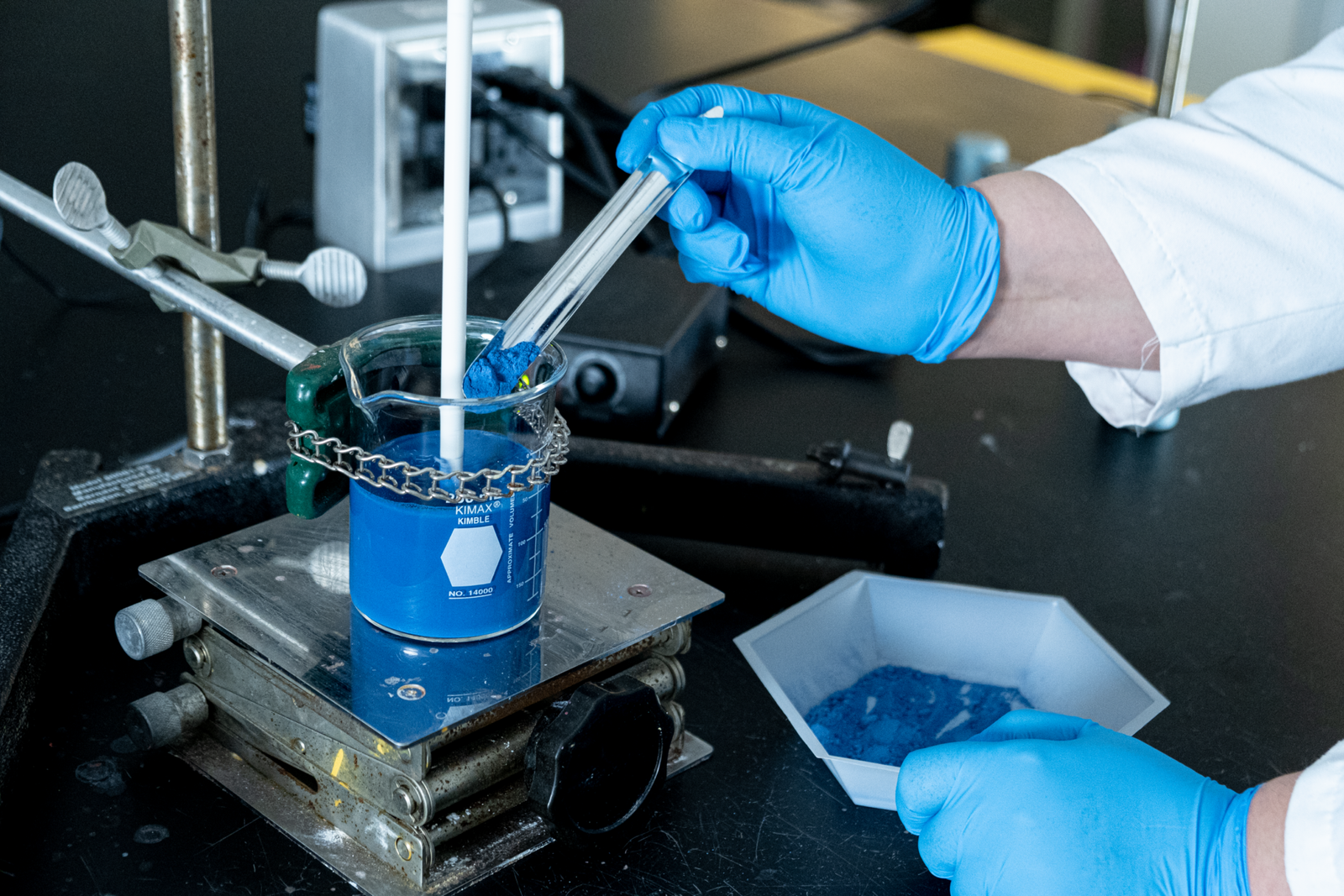
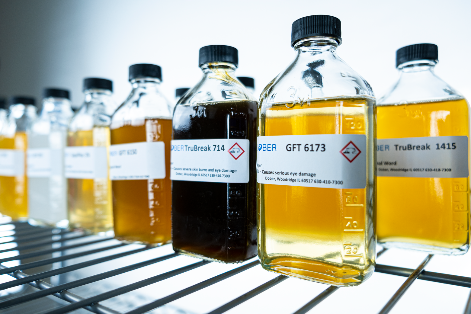
I began with a full brand audit and conversations with leadership to understand where the company was headed. From there, I developed a new art direction rooted in Dober’s environment itself. The color palette was inspired by the chemicals and powders used in their labs. The overall tone leaned scientific and forward-looking without becoming cold or abstract.
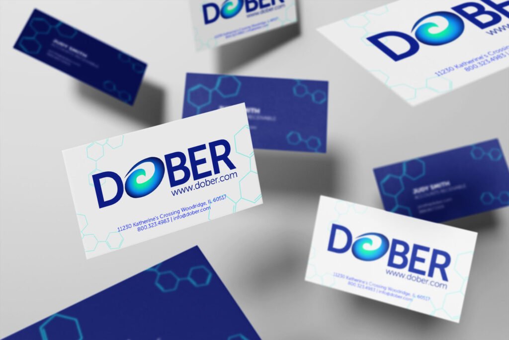
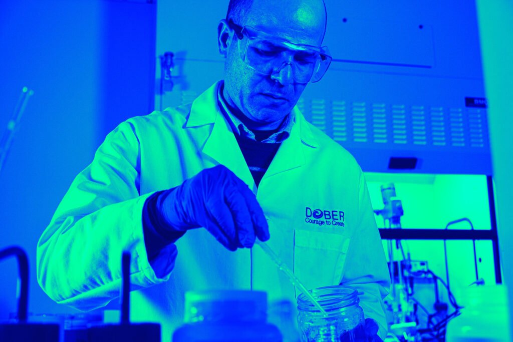
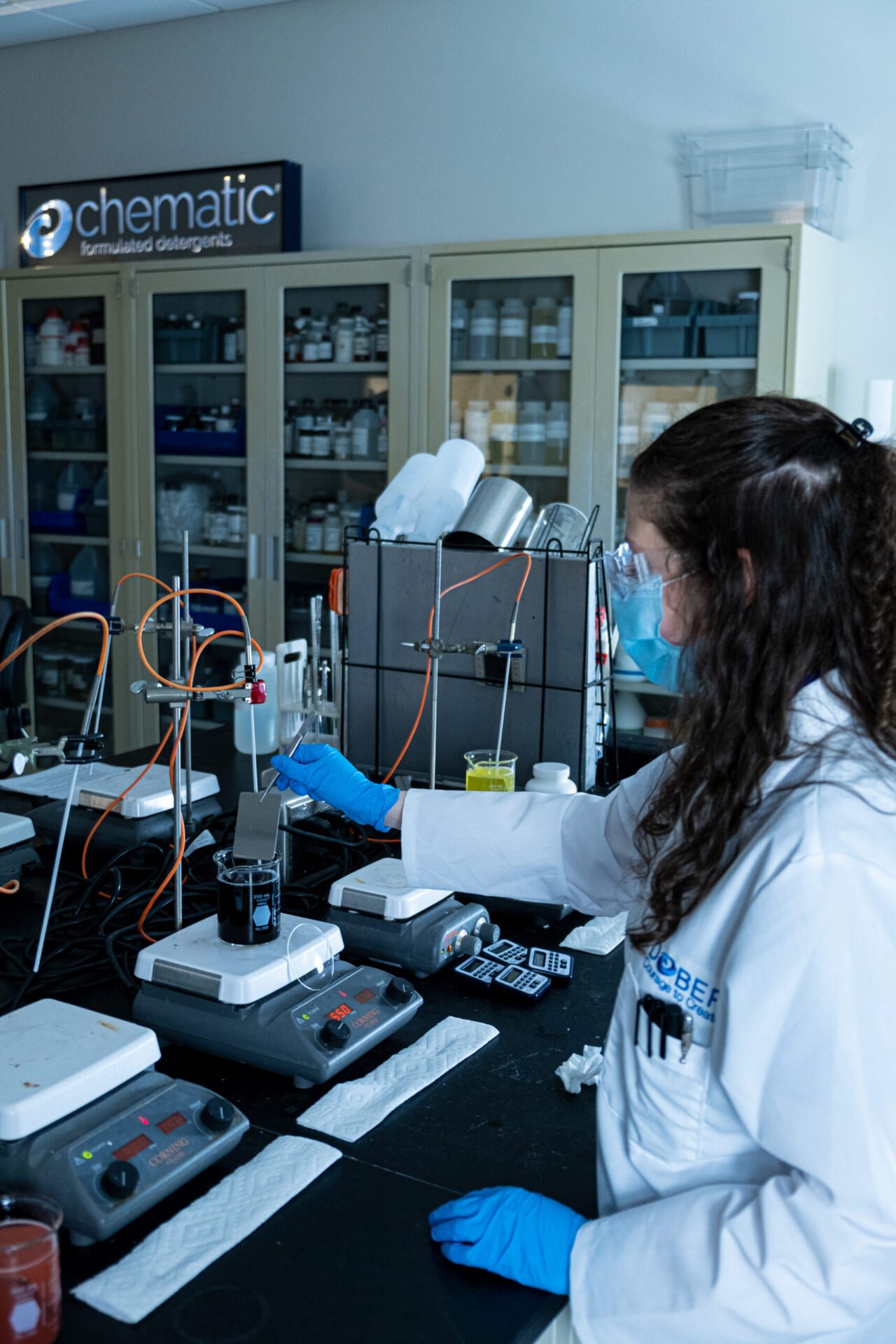
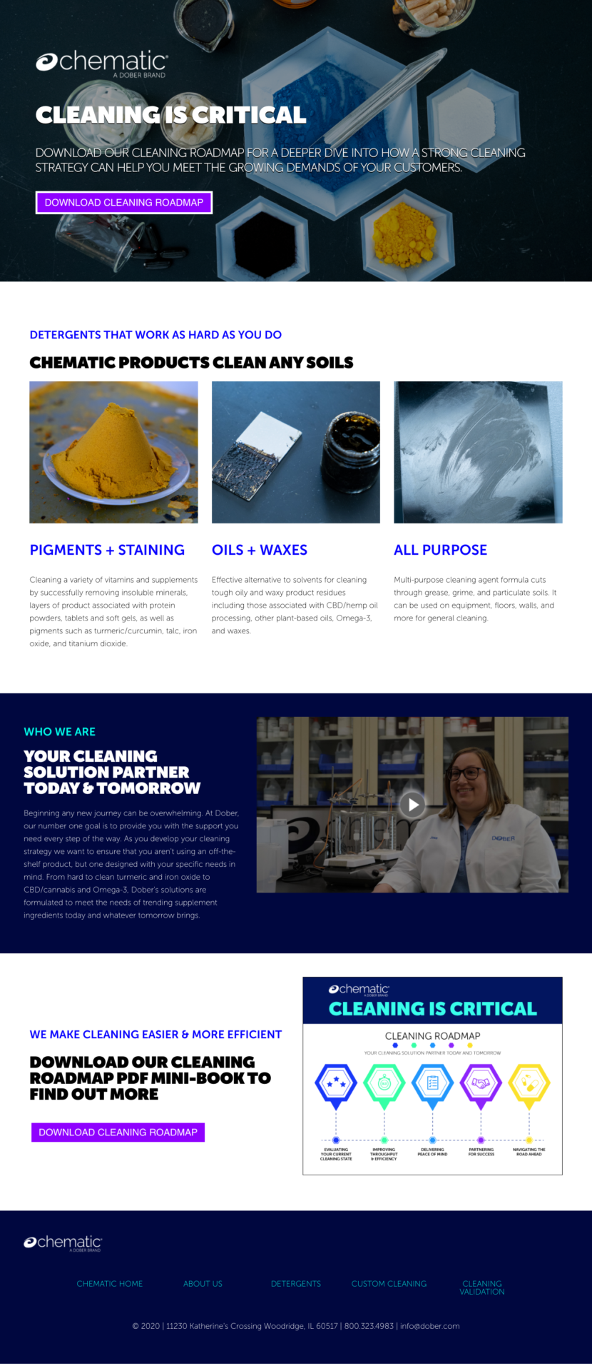
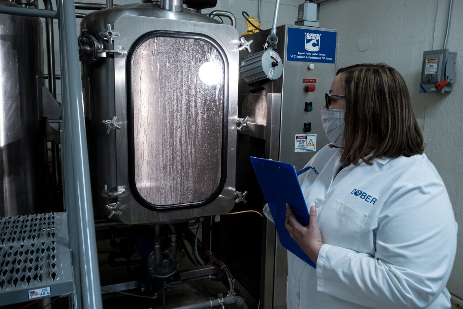
I photographed Dober’s labs, processes, and scientists to bring authenticity into the brand. Those visuals became the foundation for a redesigned website, updated collateral, and a complete library of templates and digital assets. The result was a brand system built for clarity, credibility, and long-term use across teams.