Translating a novelist’s vision into a cohesive visual system
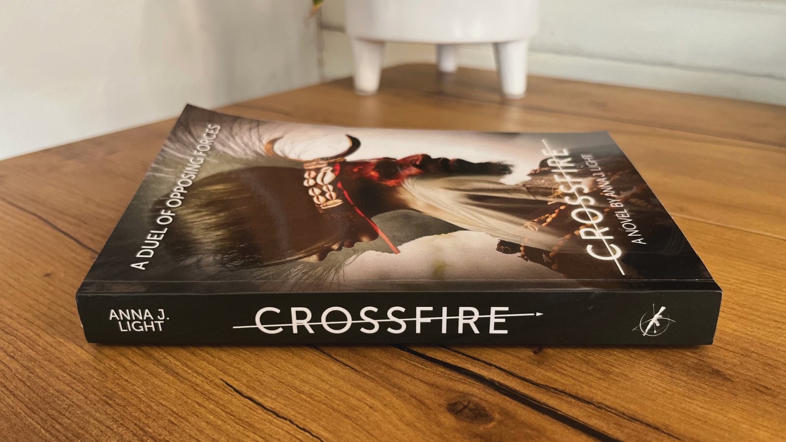
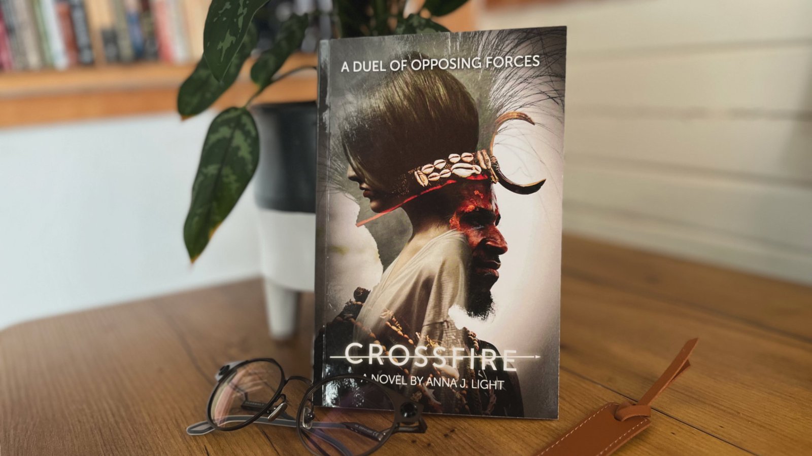
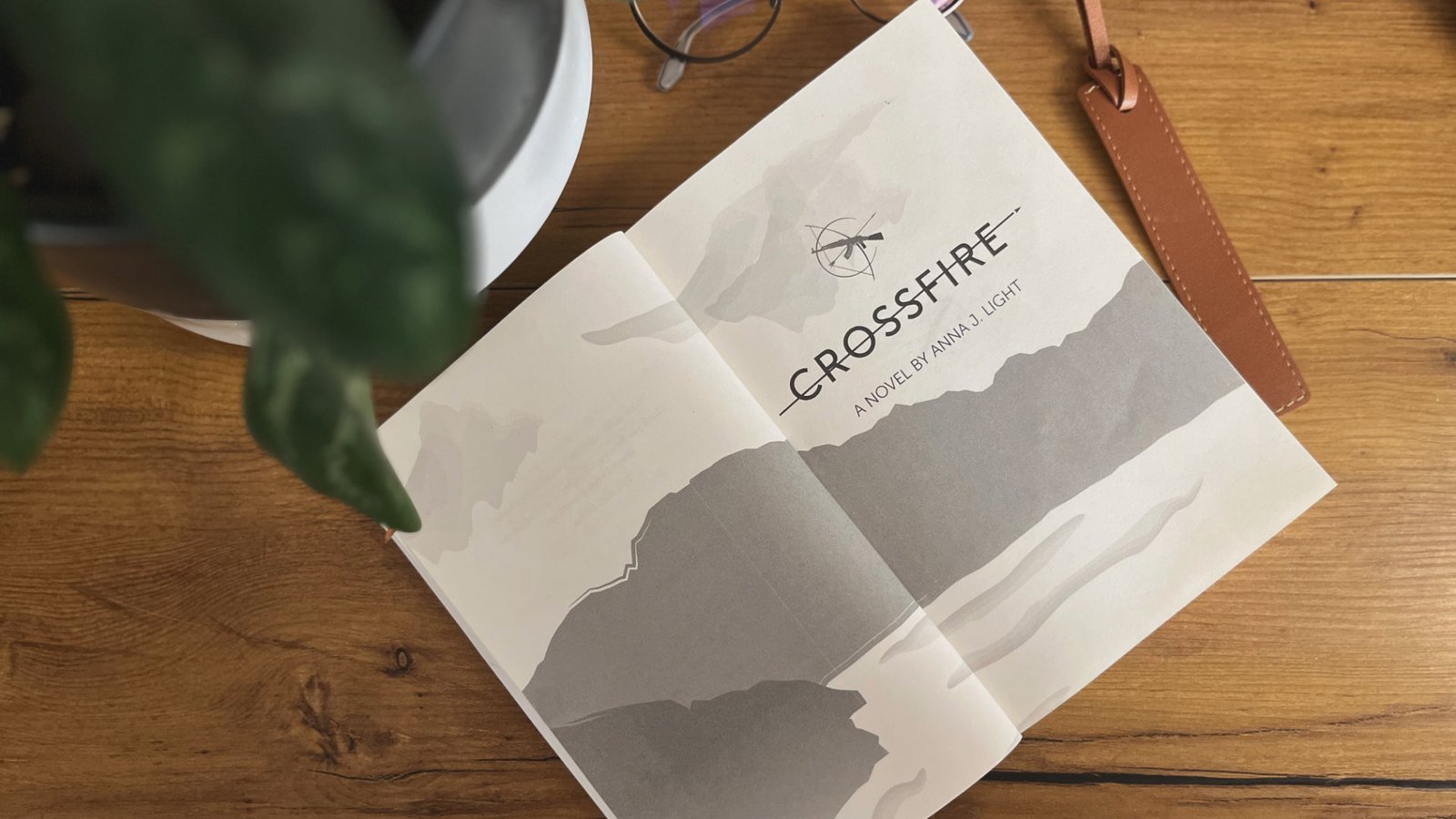
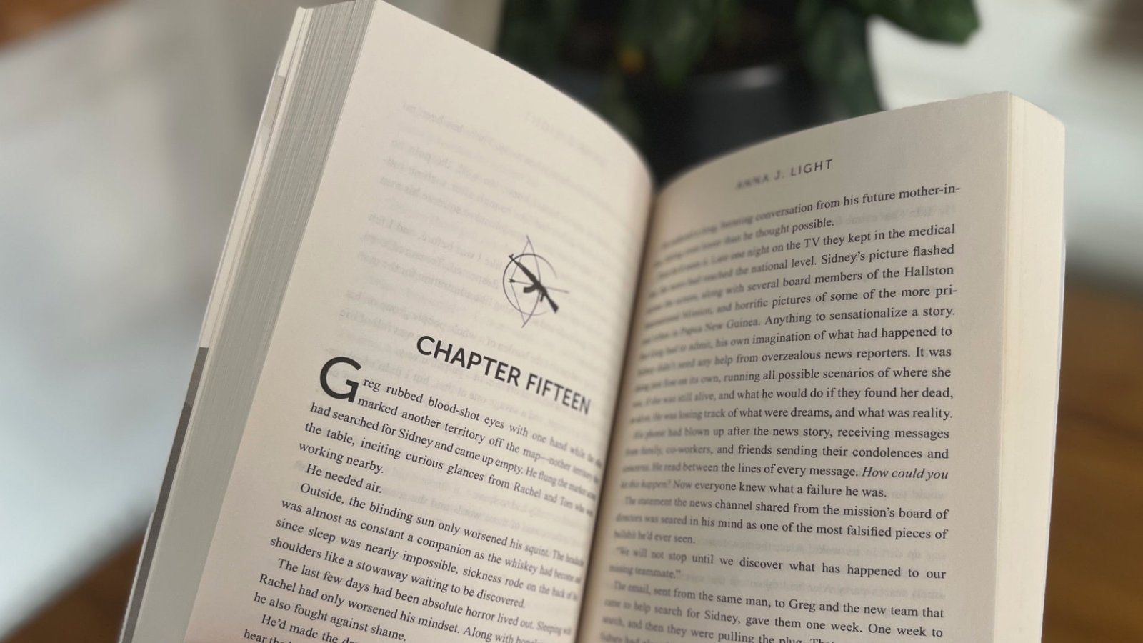
For Crossfire, we partnered closely with debut novelist Anna Light to translate the story she carried in her head into a fully realized visual world. Beginning with the cover, we collaborated through concept, art direction, and aesthetic refinement until the design captured the novel’s central tension—love and war, restraint and surrender, ancient belief and forward motion. After seeing the cover, Anna entrusted us with the full interior layout as well, allowing us to build a cohesive system across the entire book. We designed a custom title logo, developed symbolic iconography (a machine gun and bow-and-arrow) to echo the story’s opposing forces, sourced and composited photography, selected typography that balanced modern clarity with emotional weight, and packaged the final product for both print and Kindle. The result is a debut novel presentation that feels intentional, immersive, and unified—supporting Anna’s voice while giving Crossfire a visual identity strong enough to stand on its own.